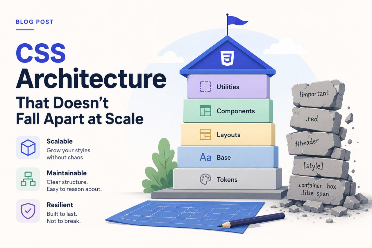
Why CSS Architecture Matters
CSS doesn't break the way JavaScript does. There's no stack trace when a button looks wrong. Instead, specificity conflicts silently override your styles, global side effects creep in, and six months later nobody wants to touch the stylesheet because changing one thing breaks three others.
Good CSS architecture prevents that.
The Problems to Solve
Before choosing an approach, name the problems:
- Specificity wars —
.header .nav .link.activebeats.link, and nobody planned for that. - Dead code — Styles for components that no longer exist, silently shipped forever.
- Implicit coupling — Changing
.cardbreaks the sidebar, the modal, and the product page. - Naming collisions — Two developers both write
.titleand one silently wins.
Design Tokens First
Start with design tokens — named values for your design constants:
:root {
  /* Color */
  --color-primary-500: #3b82f6;
  --color-primary-600: #2563eb;
  --color-neutral-900: #111827;

  /* Spacing */
  --space-1: 0.25rem;
  --space-2: 0.5rem;
  --space-4: 1rem;

  /* Typography */
  --font-size-sm: 0.875rem;
  --font-weight-semibold: 600;

  /* Radius */
  --radius-md: 0.375rem;
  --radius-full: 9999px;
}
With Tailwind CSS, tokens live in tailwind.config.ts under theme.extend. The point is that your entire UI draws from a single set of values. Change --color-primary-500 once and it propagates everywhere.
Component Isolation with Tailwind
Utility-first CSS (Tailwind) solves specificity wars and dead code naturally:
- Styles are attached to elements, not class selectors shared across the codebase.
- Purging removes any class not found in your source at build time — no dead code.
- Every developer writes the same way.
The challenge is long, messy class strings. The solution is component extraction:
// ❌ Repeated everywhere
<button className="rounded-md bg-blue-600 px-4 py-2 text-sm font-semibold text-white hover:bg-blue-700 focus:ring-2 focus:ring-blue-500">

// ✅ Extracted once
function Button({ children, ...props }) {
  return (
    <button
      className="rounded-md bg-blue-600 px-4 py-2 text-sm font-semibold text-white hover:bg-blue-700 focus:ring-2 focus:ring-blue-500"
      {...props}
    >
      {children}
    </button>
  );
}
You abstract the component, not the class. The Tailwind classes stay readable and explicit inside the component definition.
The cva Pattern for Variants
Component variants get messy fast. class-variance-authority (cva) is the cleanest solution I've found:
import { cva } from "class-variance-authority";

const button = cva(
  "rounded-md font-semibold transition-colors focus:outline-none focus:ring-2",
  {
    variants: {
      intent: {
        primary: "bg-blue-600 text-white hover:bg-blue-700 focus:ring-blue-500",
        secondary: "bg-gray-100 text-gray-900 hover:bg-gray-200 focus:ring-gray-400",
        danger: "bg-red-600 text-white hover:bg-red-700 focus:ring-red-500",
      },
      size: {
        sm: "px-3 py-1.5 text-sm",
        md: "px-4 py-2 text-base",
        lg: "px-6 py-3 text-lg",
      },
    },
    defaultVariants: {
      intent: "primary",
      size: "md",
    },
  }
);
All variant logic is co-located, type-safe, and readable.
Global Styles: Keep Them Minimal
I limit globals.css to:
- CSS custom property declarations (design tokens)
- CSS reset/normalize
- Base typography defaults (
body,h1–h6) - Third-party library overrides that can't be handled inline
Everything else belongs in components.
The One Rule That Prevents Most Problems
Never write a utility class that sets a visual property by name (e.g., .blue-text, .big-heading). Name by intent (.text-primary, .heading-xl) or use a framework like Tailwind. When "blue" changes to "teal", intent-named classes still make sense. Color-named classes become lies.